Land Control 2
With a water theme
The problem with the original land control is that the 8 way movement and 1 speed restricted the kind of jumps the player could make.
With land control 2 I'm looking to refine the movement.
It's first game I've ever tried implementing gamepad support for and it works pretty well apart from being too responsive currently.
I'm playing with the idea of pipes and more ways of changing the land/water (ice and steam?).
I've been playing Alec Holowka and Derek Yu's 'Aquaria' recently to get a feel for how they handle the movement.
Nevertheless, I'd like to work on this some more once I get time to do so.
Games I've Made
Tuesday, 1 September 2015
15 - DashDancer
There are a few different development stages for this game but I'll only go over the most recent.
(The enemy is broken in this version)
I've been playing a lot of 'Super Smash Brothers Melee' recently and there is an advanced tactic called 'dash-dancing' (and wave-dashing) where the goal is to move in and out of your opponents attack range (whilst they are doing the same thing) in order to bate an attack that you can counter.
DashDancer is a game exploring dash dancing as a central game mechanic (rather than a secondary one). The game currently also has fast-falling, edge-grabbing, jumping and crouching too. They are in the game more as an experimental thing for me to decide what works well.
Thematically I like the idea of every character dancing their own styles in a world of dance. With dash-dancing being the style of the player character. Or maybe Ice skating.
You can download the game
(Includes v3 which has a more interesting level layout (no fastfall) )
Controls:
left & right - dash
Z - jump
Q - switch between constant movement and dash only movement
down - crouch
down in the air - fastfall
14 - Zombie Rocket
Zombie Rocket was my entry to Ludum Dare 32, the 48 hour game Jam.
I started a little late so I made this game in 2 and a half hours.
The theme was 'An Unconventional Weapon'.
The game requires you to defend yourself from oncoming zombies using your 2 remote controlled rockets. You control one with 'A' and 'D' and the other with 'left' and 'right'. They feel similar to the 'nikita' missile from MGS2 due to their slow speed when turning.
I included optional colour variations too to try and bump my score up a bit more.
The game isn't great, it's fairly basic with no variation in gameplay. The thrill comes mostly in the form of vertigo; panic whilst trying to control both rockets at once.
Overall, a decent LD entry. Better than 'microsystem'.
Here's the download link
Friday, 26 June 2015
Game 13 - Cardball
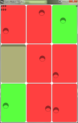
Therefor, the aim of the game is to dodge as many holes as possible before scoring, for maximum points. Upon scoring, the card is destroyed to create a gap.
The player has the choice of moving cards around the board freely but tapping on one, raising it, and tapping in another spot to swap it with whatever is in the space, whether it be full or not. This allows the player to set up high-scoring shots. Also the ball can bounce off of raised cards.
Download the game HERE
Controls:
left click - Swap Cards
right click and drag - aim and shoot the ball (from anywhere on the board)
R/ Control/ Shift - bring up menu
on ios/android this would be tap and drag but I coded it slightly differently for the prototype.
Also, the different card colours don't mean anything. It was just for debugging during development.
Game 05.5? - Rising Deep Remake
It's been 3 months since I last updated the blog. A combination of uni work and laziness is to blame. That's not to say I haven't been working on anything in the meantime. I'll catch you up on all the games I've been making.
I've been doing some more work on Rising Deep. The name will probably change as I keep calling it Deep Rising by accident.
Still placeholder graphics but as you can see, I wanted to reduce the visual information so block types are going to be reduced and I'm not running the 'everything is 4 pixels or less' thing as it caused too much confusion.
In terms of theme I liked the idea of the game being set in a cave this time like the game 'Knytt'. It would allow me to play with the idea of one huge level with a view that scrolls as if it's made of separate rooms. With characters potentially very far from eachother the option to scroll out would be an option too.
Down the right side of the screen would be stats, goals, pickups etc.
I also liked the idea of torches and the characters acting like light sources, revealing information on the walls behind them.
Anyways, I scrapped this idea
The long distances wasn't really viable as it would take forever to find your way around, and the characters on their own just aren't that much fun to play as the interesting decisions come from how the characters interact with eachother.
Both of these levels are actually in the playable thing I included but they represent different games.
The game to the right is my next idea, and it's set on a ship again.
Graphics would be drawn over the top?
Apparently the ship has crashed?!
Initially the player is introduced to each character separately. The water has not made its way into the ship yet. Eventually the characters will meet, (are they the only survivors?) and once the player is comfortable in how the characters can interact with eachother, still-water levels will be introduced. And once the player is comfortable with this, rising-water levels will be introduced.
The idea is that generally the levels will be quite small, like the bonus ones in the original Rising Deep with the occasional large level with perhaps a shortcut upon completing it. The necessity of the shortcuts are because I want all the levels to be interconnected in this one with MOSTLY puzzles involving sticking together but occasionally puzzles which might involve one or two of the characters taking alternative routes.
I also like the idea of the ship falling over at some point and all the levels being flipped by 90 degrees.
Anyways, here's the link to the new exe. It's pretty buggy (skip to the next level with 'P') and you can change camera modes with 'Spacebar'. There isn't that much to do but It should give a rough idea of where I hope to take the game =] (it'll take a little while to start because it has to compile the music)
Wednesday, 25 February 2015
Game 12 - Reverse Rhythm Shooter
It's mini ludum dare 57 and the theme is 'reversed'.
I've been playing a lot of Osu! recently so rhythm games were at the forefront of my mind.
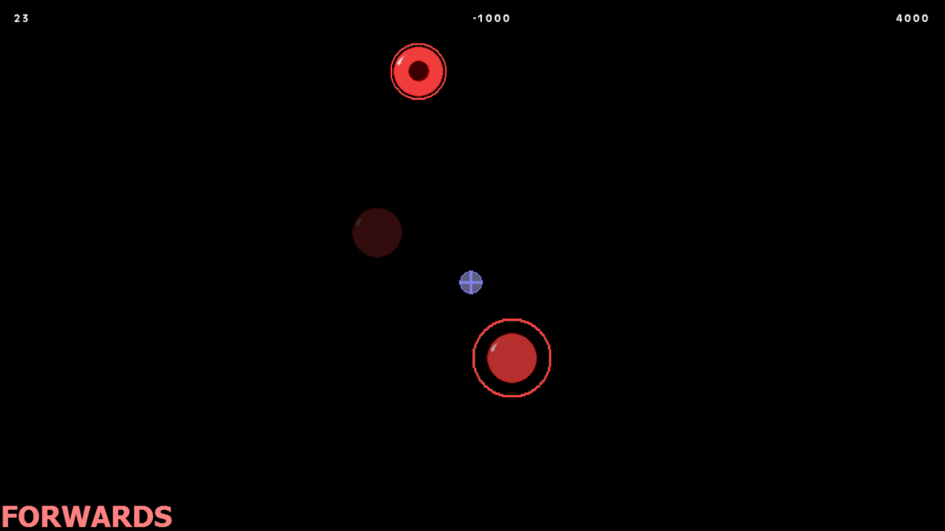 What I've created do far is a target shooting game which, when the music finishes, becomes a rhythm game in reverse. (actually the first bit is the reversed bit but whatever).
The beats which come up are exactly the same as the shots you made but in the opposite order (with timing still intact).
Anyways, so far the game has been more of a challenge to make in terms of programming than design. To be honest, other than the novelty of the idea, I don't feel like the game is particularly strong design wise yet.
There's nothing really compelling about the gameplay but I DO have a few ideas on how to improve that (and I don't mean just juicing it up).
The next thing I'm going to do is increase the number of targets to hit in 'reverse' mode. At the moment it's too easy to hit every one and that makes it seem too much like the rhythm part. The benefits of this are:
- More decisions and strategy in the 'shooter' bit
- More variety in the rhythm part due to the different ways that people will tackle the first part
One good design thing about the game so far actually is the way that the difficulty of the rhythm part is directly related to the players skill in the shooting part. I.e, the second part should always be challenging if the player did their best in the first part. BUT only if the first part has no skill cap (which is another reason for the change in the previous paragraph).
By the way, I also have some older versions of the game.
Versions 1, 2, and 3 are kind of like 'make your own Osu! map in reverse'.
Version 4 is a variation on the shooting (The music is placeholder (The song is by Disasterpiece btw))
Version 5 is basically version 6 (so I didn't include it)
Version 6 is what I described at the start of the post (slightly updated since those screenshots)
I've been playing a lot of Osu! recently so rhythm games were at the forefront of my mind.
 What I've created do far is a target shooting game which, when the music finishes, becomes a rhythm game in reverse. (actually the first bit is the reversed bit but whatever).
The beats which come up are exactly the same as the shots you made but in the opposite order (with timing still intact).
Anyways, so far the game has been more of a challenge to make in terms of programming than design. To be honest, other than the novelty of the idea, I don't feel like the game is particularly strong design wise yet.
There's nothing really compelling about the gameplay but I DO have a few ideas on how to improve that (and I don't mean just juicing it up).
The next thing I'm going to do is increase the number of targets to hit in 'reverse' mode. At the moment it's too easy to hit every one and that makes it seem too much like the rhythm part. The benefits of this are:
- More decisions and strategy in the 'shooter' bit
- More variety in the rhythm part due to the different ways that people will tackle the first part
One good design thing about the game so far actually is the way that the difficulty of the rhythm part is directly related to the players skill in the shooting part. I.e, the second part should always be challenging if the player did their best in the first part. BUT only if the first part has no skill cap (which is another reason for the change in the previous paragraph).
By the way, I also have some older versions of the game.
Versions 1, 2, and 3 are kind of like 'make your own Osu! map in reverse'.
Version 4 is a variation on the shooting (The music is placeholder (The song is by Disasterpiece btw))
Version 5 is basically version 6 (so I didn't include it)
Version 6 is what I described at the start of the post (slightly updated since those screenshots)
HERE IS THE
TO ALL THE VERSIONS OF THE GAME CURRENTLY (minus v05)
Game 11 - Jet-pack Cowboy + HTML
It's been a very long time since the last update. University work has been at the front of my mind recently so I've had less time to work on games.
Just a quick update on the new day/night cycle inCowboy Shootout Jet-pack Cowboy.
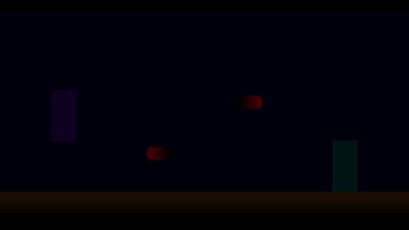
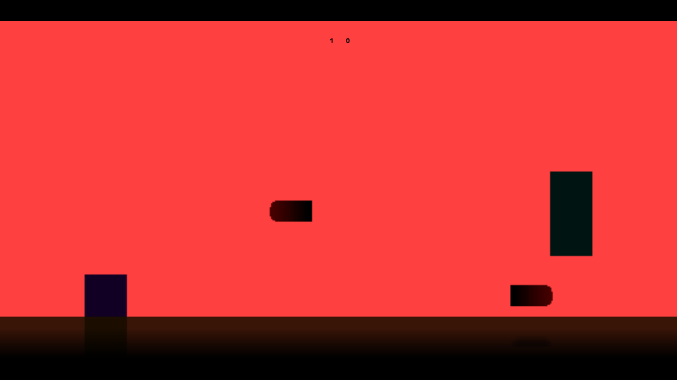 The day/night cycle has only been implemented in the 2 player version thus far but I think it looks pretty nice. I also added shadows.
 I bought the HTML5 expert module a little while ago too before GM:S announced that they'd been bought by Playtech. Turns out that building for the web has a loads of extra things you have to consider when programming or your game will run like shit.
Anyways, now that I can techinicaly make browser games I have a much wider potential audience using websites like Newgrounds and Kongregate as hosts.
Just a quick update on the new day/night cycle in
 The day/night cycle has only been implemented in the 2 player version thus far but I think it looks pretty nice. I also added shadows.
 I bought the HTML5 expert module a little while ago too before GM:S announced that they'd been bought by Playtech. Turns out that building for the web has a loads of extra things you have to consider when programming or your game will run like shit.
Anyways, now that I can techinicaly make browser games I have a much wider potential audience using websites like Newgrounds and Kongregate as hosts.
LINK to newest version
PS. I didn't make the spaceships yet
PPS. I don't remember if I made sandstorms yet
PPPS. Still in development?
PS. I didn't make the spaceships yet
PPS. I don't remember if I made sandstorms yet
PPPS. Still in development?
Monday, 19 January 2015
Game 11 - Cowboy Shootout
Over the Christmas holidays I've been playing with a new prototype based on the terribly difficult section of my favorite game, Rayman 1 where you get to fight 'Space Mama'. Put simply, there is a section in the fight when she shoots laser beams at different heights towards Rayman, and to dodge them you either need to jump or crawl. The aim is to get as close to 'Space Mama' as possible in order to inflict damage, but obviously doing so reduces your chance to react to the next shot. I like the simplicity of the fight.
I wanted to simplify the movement of the characters to only y-axis with bullets traveling along the x-axis
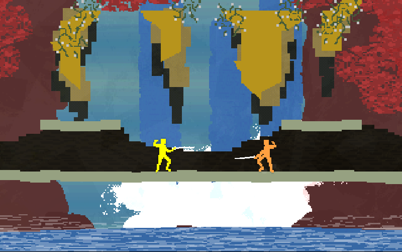 I was also inspired by 'Nidhogg's' vast depth within it's simplicity; elegance. Every attack has a counter, every defense has a weakness.
It's inspirational knowing that such a deep fighting game was made using the same software I use; Gamemaker:Studio.
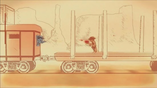 I played with a lot of different variations of the idea and I'm considering expanding the game into a space cowboy themed, shooter/platformer similar in part to Gunman Clive.
Not that Gunman Clive was one of the original inspirations of the idea, it certainly shares some aspects of what I've created.
What I've created
A variety of different prototypes about the same idea.
2 Player Mode:
Arcade Mode: (3 different difficulties)
Shoot the red rings and dodge the bullets. Watch out for recoil as the speed increases every turn.
Dodge Mode:
Dodge multiple shots at the same time as they bounce back from the wall behind you.
If I ever made this into a full game I'd certainly include these fun mini-games/prototypes as bonuses.
I'm currently working on a Cowboy Shootout/ Jet-pack Cowboy Collection V2 with more variations on theme, updated graphics and a night/day cycle (which will effect game-play). Watch out for sandstorms by day and Spaceships by night.
I've also started experimenting with the x-axis and platforming too.
Tuesday, 9 December 2014
Game 00 - Beneath The Skin
My Ludum Dare 29 entry; my first ever (finished) game
This game doesn't actually have it's own post so I thought I'd give it one.
The theme was 'Beneath the Surface'.
Since my bi-maxillary ostectomy operation (under-bite operation) was coming up I wanted to play with my anxieties 'under the surface' of what my face might look like after the operation as well as the physical act of seeing under the surface of my skin. The game isn't particularly well programmed as it was my first game (a lot of it is drag 'n' drop') but I learnt a HUGE amount from the process and it's what started me really making games.
The player has the option to remove facial features, rotate, rescale and replace them with various other objects in order to 'play the surgeon'. The game was partially inspired by 'Dead Baby Dress Up' by Edmund Mcmillen and by the surgeon from 'Bioshock'.
The soundtrack is a recording of me playing a song I wrote on the piano. It gives the game a spooky, yet sad and melancholic feel.
'Beneath the Skin' is probably my most personal game to date and is certainly one of my favorites. I'd like to work more in this direction for my next game (most recent game being 'Too Many Windows').
If you'd like to play 'Beneath the Skin' you can download it HERE
Game 10 - Too Many Windows
The theme was 'Entire Game on One Screen'
It wasn't a theme I was particularly happy with but it could certainly have been worse. The problem is that MOST games fit in to the theme of 'one screen' so part of the challenge was trying to find a way to limit myself further. Meaning comes from conflict so in respect to the theme I wanted to focus on the conflicts that one screen could bring to the game. The most common reason someone might want a second or third monitor would be to increase the amount of screen space in order to see everything they want to at the same time.
That's the conflict I went with, I'll limit the information the player has by restricting the amount of things the player can see at one time due to their limited screen space.
Everyone can relate to the troubles trying to find specific windows in the crowd of other windows so I played along with that theme being careful to make sure that it was absolutely impossible for the player to have perfect information.
I like the way moving one window in order to gain more information directly reduces the information you get from another part of the screen by the way the windows all overlap. This is where the fun is generated because the player has to be constantly moving things around in order to get the information they need to keep playing.
Another huge source of the fun in this game is the scoring mechanism. I think the way I decided to make it was possibly the most important decision in the whole process.
The player starts with 10 seconds on the clock and a score of 0. Their goal is to increase their score as high a possible.
Every time the player clicks a button, their score is increased by 100 and their time is increased by 2 seconds. This would potentially lead to a remaining time well above 10 seconds and in play-testing this was common. The problem being that when the player has a lot of time to find the buttons, the game loses a lot of its suspense and the gameplay becomes quite mundane.
So I changed the way the scoring works whereby if the time is less than 10, the player is awarded 2 seconds per button click and if the score is above 10 the player is only awarded 1 second of time. This way, as long as the player hovers much more closely to 10 seconds remaining, which keeps the anxiety and thrill consistently high.
Also, for the really good players, if their score gets above 10000 then the 2 second bonus is only awarded if their remaining time is below 5, requiring even greater concentration.
I think it was Tom Francis who said that a good game is fun to play around with even without goals. With that in mind I juiced the game up. The windows retain their momentum after you move them so you can essentially throw them around the screen and they'll bounce around with various 'bouncy' noises and particle effects. This is satisfying because the feedback loop is very short. It also makes the game particularly entertaining when the player starts to panic, throwing windows all over the place. It also creates a conflict between being both quick and accurate with your clicks.
I also juiced the game up with explosions which occur every 1000 points. Screen shake occurs as a satisfying explosion noise is played and the windows all move off at random speeds in random directions, bouncing everywhere. It makes the game briefly more difficult but is also really satisfying and acts a little reward for gaining another 1000 points.
I don't claim to be musically talented and the soundtrack could certainly have been improved but It was enough to give the game some level of tension and immersion. If the 4 bar loop does get annoying though, I have included the option to turn music off as well as the option to turn SFX off If the player wants to listen to their own music or something.
Every commenter so far has stated that the game is very fast paced and fun, as a ludologist this makes me very happy. One commenter mentioned that the windows could've been things like web-browsers and addware, and honestly I wish I had realized the importance of that sooner. I think it's a brilliant idea and would've certainly improved the game. I could've randomized the windows somewhat as well with subtle variations on webpages and it wouldn't have taken too long to implement.
I'm very happy with how the game turned out (although it would've been nice to add in those window variations). I think it'll score more highly than my previous two entries on 'fun' and maybe 'theme' and 'overall'. I'll probably score lower than 'Beneath the Skin' on 'audio', 'innovation' and 'mood'. I'll probably beat 'Micro-System' on every aspect because it was honestly not very good.
Play 'Too Many Windows' HERE
Monday, 10 November 2014
Game 08 - Procedural Silhouette Generator
For ProcJam 2014 I've been developing my procedural Silhouette Generator. It's now much more useful with options to change the width and height of the generation area, the complexity of the silhouette and the shapes the silhouette is made up of. The opacity variation is now consistent between silhouettes.
You can download the updated Silhouette Generator from itch.io or right here with this widget
You can download the updated Silhouette Generator from itch.io or right here with this widget
Sunday, 26 October 2014
Game 09 - Instrument: Bit stuck
I don't know particularly much about music theory. It's been very difficult to figure out a way to reward good play. I'd like to make this game into something but I'm not sure where to take it.
Here is an image of the current state of the game.
Controls:
C,V,B,N,M - play sounds
(hold) left shift - higher octave
(hold) left control - lower octave
Download here:
For now, I think I'll focus my attention to the top down version of Deep Rising (but with fire).
Perhaps I'll give this instrument another go.
Thursday, 23 October 2014
Game 09 - Instrument
I keep saying that I want to make an instrument. What I mean is that I want to create an abstract game controlled through improvisational music.
This is what I've made so far. I've spent less than an hour on it.
You can make noises with the ASDF keys (the KL keys do the same as DF) and the shapes react. So far all they do is grow slightly larger, then shrink back down to their original size.
I plan to add more shapes and sounds as well as a scoring mechanism which rewards good sounding music, based off timing and complimentary sounds etc.
Also, I'd like to make a really pretty game this time. Previously I've hardly focused on the graphics (although I did spend a fair amount of time on Rising Deep's aesthetic). This time I'd like particle effects, screen shake, and all that juicy stuff.
Game 08 - Random Silhouette Generator
The first project for my course requires me to develop a character as well as an environment. The first part of character development normally comes down to drawing lots lines on a photoshop canvas until it looks like a potential character, then moving on and doing 100 or so more.
I decided to play with the idea of randomly creating shapes since it's particularly difficult to express randomness as a human, so I made a random silhouette generator in game maker to do it for me.
I decided to play with the idea of randomly creating shapes since it's particularly difficult to express randomness as a human, so I made a random silhouette generator in game maker to do it for me.
Controls:
spacebar - generate a new silhouette
left shift - increase opacity
left control - decrease opacity
 |
| A compilation of some silhouettes I made using my software (Compiled in Photoshop) |
The way the generator works is it creates a random number of shapes (within a range), the shapes then randomly turn into other shapes (for diversity), They then move their point of origin to a random x and y axis within the canvas, they spin around a random number of degrees and deform their height and width by a random variable (within a range) too.
Since the random number generator in game maker always chooses the same numbers, the software results in the same 'random' shapes every play, unless I change an argument or variable slightly between plays. Since then I've also added another variable that increases every step by 1 until it hits 11, at which point it returns to 1 again. This way, the player unknowingly has an influence on the generation of the shapes. Since it's almost impossible to time something to 1/120th of a second, the player should get different shapes every play.
There is a 1/10 chance of getting the same first shape, but that probability reduces exponentially every shape the player makes and even then, it's not a big problem.
Subscribe to:
Comments (Atom)


